“
Using construction date and sale price information from RPData – which drills right down to provide the details at an individual lot level – allowed the Urbis GIS team to create an index as to whether the price that it was sold for was higher or lower than the median sale price for that suburb in that year.
The developer community is really interested in understanding this premium. What is open space proximity worth? What is accessibility to public transport worth? Really, how much is it worth for my site? This is where the Urbis GIS team can get ‘hyperlocal’.
Urbis recently provided visual data on the outer south-eastern Perth suburbs of Gosnells, Huntingdale and Thornlie to inform market outlooks for a client. Using construction date and sale price information from RPData – which drills right down to provide the details at an individual lot level – allowed the GIS team to create an index as to whether the price that it was sold for was higher or lower than the median sale price for that suburb in that year.
This visualisation highlights where a premium was being paid for property. The housing construction date allowed the team to create a map which clearly shows where the wave of developments in the area over time from the establishment of these suburbs prior to 1960 up to the present day.
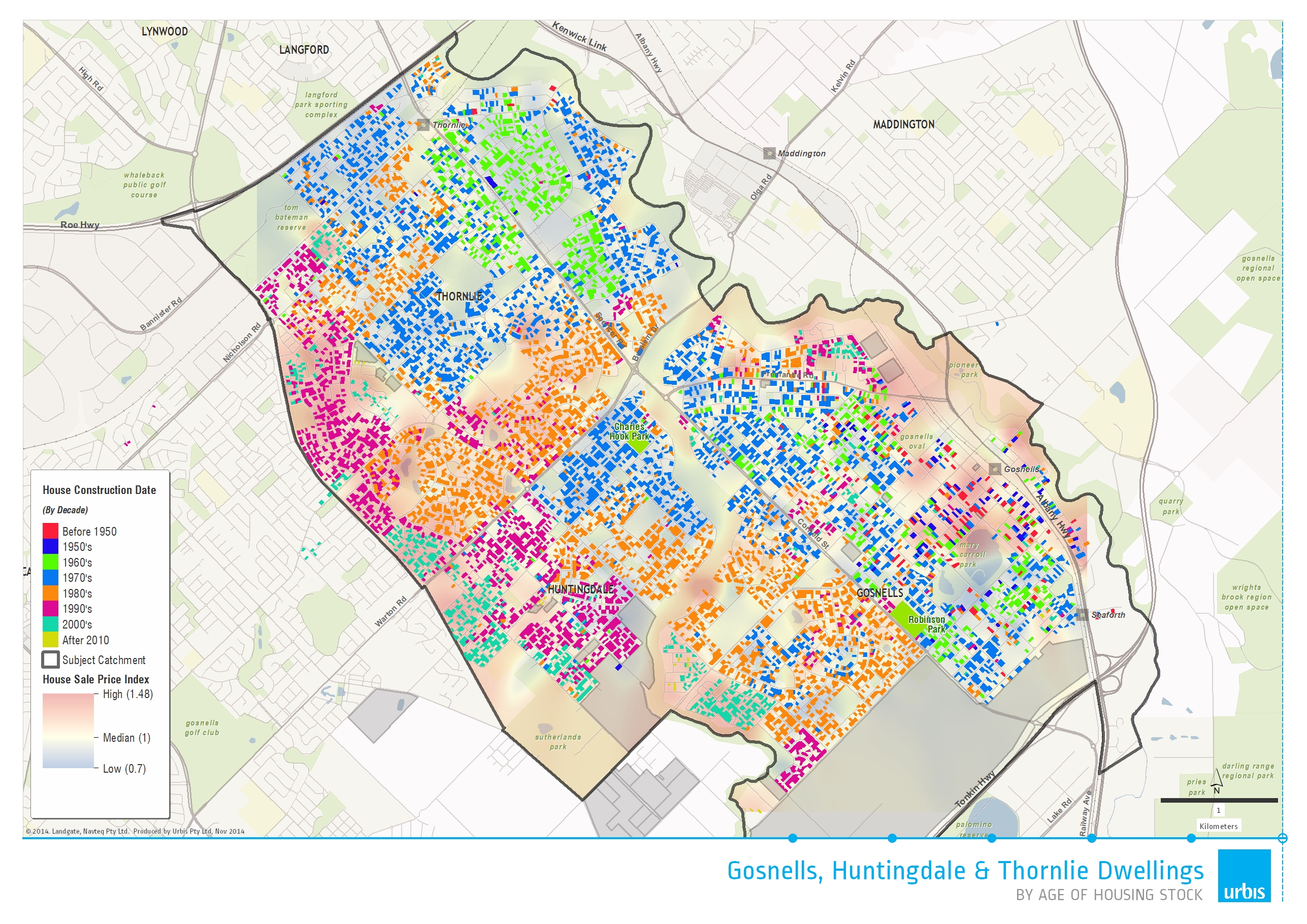
By starting to quantify the attractiveness that people are prepared to pay for proximity to certain services, you can identify that there’s a premium here on being close to public transport – in this case, Gosnells station. Equally, there are certain premiums with regard to proximity in certain open space assets. So the closer you are to open space – there’s a premium being paid for either being close to open space or close to a view.
The data also showed that the age of the stock around the Thornlie area tended to be homogenous, consisting of houses built between 1970 and 1990. House prices were deemed ‘hot’ for property closer to infrastructure and amenities such as schools and open spaces like parks. However, near the train stations, the properties are much more heterogeneous in construction dates, but the hot spots signal a higher premium paid for these house sales that occurred around transport nodes.
These maps give the client the ability to understand the history of a location’s housing construction, how people have either knocked down or rebuilt, or whether they’re investing in their house and against the attractiveness of the premium that people are willing to pay to be in close proximity to either public transport or to open space.
Over a long period of time, you get a sense of the value of proximity to geography, and how the value decays with distance from an asset. For example, within 200 metres of an asset, there’s a premium being paid and the further out you go, that premium decays quickly, so you are able to quantify just how influential infrastructure is in determining house prices.
Urbis has the GIS tools and services to help you get the latest insights into the property market. Contact us today to find out how.
Alistair Towers is the National GIS Manager. This article was first published in Urbis Insights – Infrastructure edition on 1 September 2015.
